
If you have ever had individual portraits taken (headshots, or senior photos) you know how stressful it can be choosing what to wear. What is most flattering, what color looks best on camera, what makes you feel your best, prints or solids? After all that, you think through all the possibility of props. And it only gets more stressful the more people you add. It’s a recipe for stress before you have even started. People often tell me is the hardest part of planning their portrait session. To help ease the stress I have a few ideas on how to coordinate outfits for your next photo session.
Choosing Colors
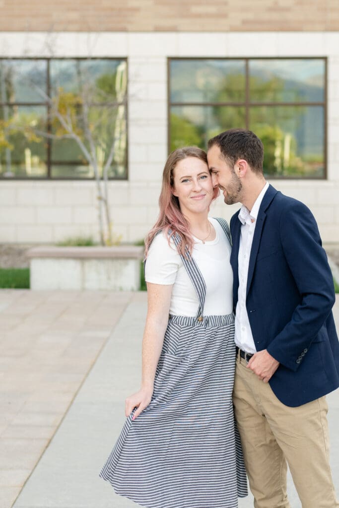
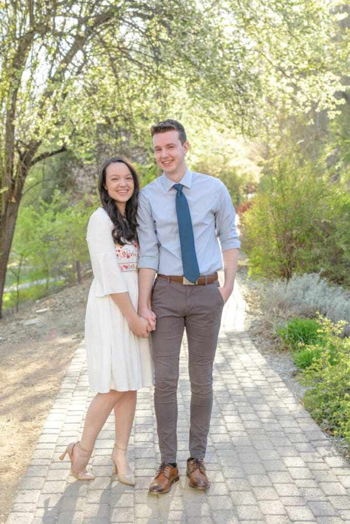
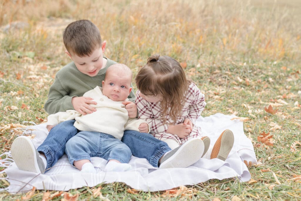
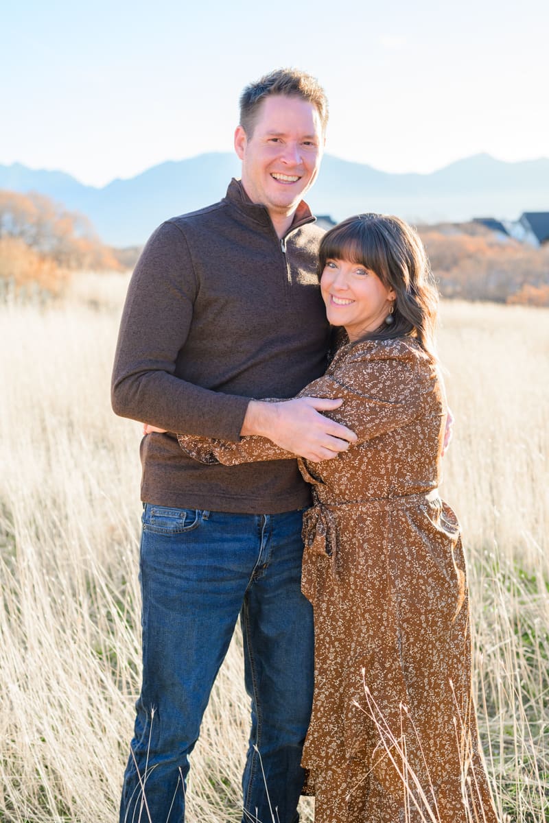
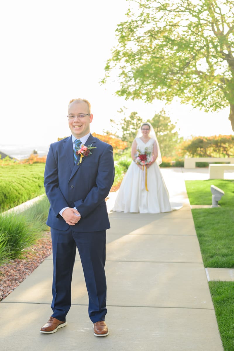
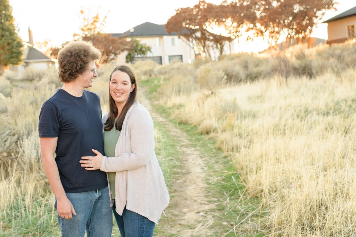
When choosing colors for your outfits, I recommend selecting lighter, neutral tones and more muted shades. Bright, bold, or neon colors are distracting and take the focus away from where it should be: YOU! I recommend light-colored, neutrals, earth tones, soft pastels, or jewel tones. Skip the bright and bold colors (they reflect onto your skin anyway), and opt for an evening with a classic palette.
How to Mix all the Colors
As you are coordinating outfits, keep in mind that your outfits will look the most cohesive on camera when the color palette and wardrobe pieces coordinate, but don’t actually “match.” In fact, I recommend avoid thinking of “matching”, and instead think about what “fits” together. The more you can mix it up, the better! Think about planning each outfit with “dominant colors” and “accent colors” in mind. If you can aim for each person in the session to have a different dominant color, and then tie in and vary the accent colors, it’ll look great all together.
What about Patterns?
Just like bright colors can take the focus away from you, so can patterns. Solid colors will help keep the attention where it belongs, whereas patterns can distract the eye. (Depending on the print, it can even lead to a phenomenon in camera called moire. A situation where a repetitive pattern causes image distortion when it interacts with the camera sensor.) In general, try to stay away from too strong of prints, avoid logos and opt for solids instead.
By varying colors and wardrobe pieces, you will create more visual interest, and allow each personality to shine through. Try these tips the next time you need to coordinate outfits for your next photo session.


+ COMMENTS
add a comment